iOS Shooter Designs Part 1: Game Screen
 It's been a bit of a hectic week for me, but I'm not going to let that get in the way of my iOS Shooter Project! Today I've been working on designs for the main game screen.
By starting with the generalities of the in-game interface first, I'll be setting some ground rules for how everything else will fit together. Once this is in place, I'll be better placed to decide on finer grained details.
The elements I'll need to include in this design will be as follows:
- Score
- Remaining lives
- Oxygen meter
- Shields
- Weapons
- Menu button (exit)
I'm going to design for the display dimensions of the iPhone 4 and 4S (640 x 960 pixels), as I have devices of this form factor to hand, and XCode defaults to the highest version of iOS when creating a project (what can I say? I'm lazy).
Animated elements in the interface will likely be rendered using OpenGL. The version of OpenGL available on iOS (OpenGL ES) requires textures that have width and height equal to a power of 2 (16, 32, 64, etc). Although this can be overridden in newer versions, I'm going to stick with this restriction as a guide to scale, and to ease any attempts at backwards compatibility to older devices. Backwards compatibility isn't a major concern, but it should be given some consideration during design if only to make things easier should I decide to tackle it at a later date.
Buttons, the score and other "static" items may be incorporated as straight UIKit interface elements, although I'm going to design them as above - as if they were to be rendered in OpenGL - for the sake of flexibility.
The iOS human interface guidelines state that the comfortable minimum size of tappable UI elements is 44 x 44 points. Thus I should aim to make all elements that may be touched at least 64x64 pixels.
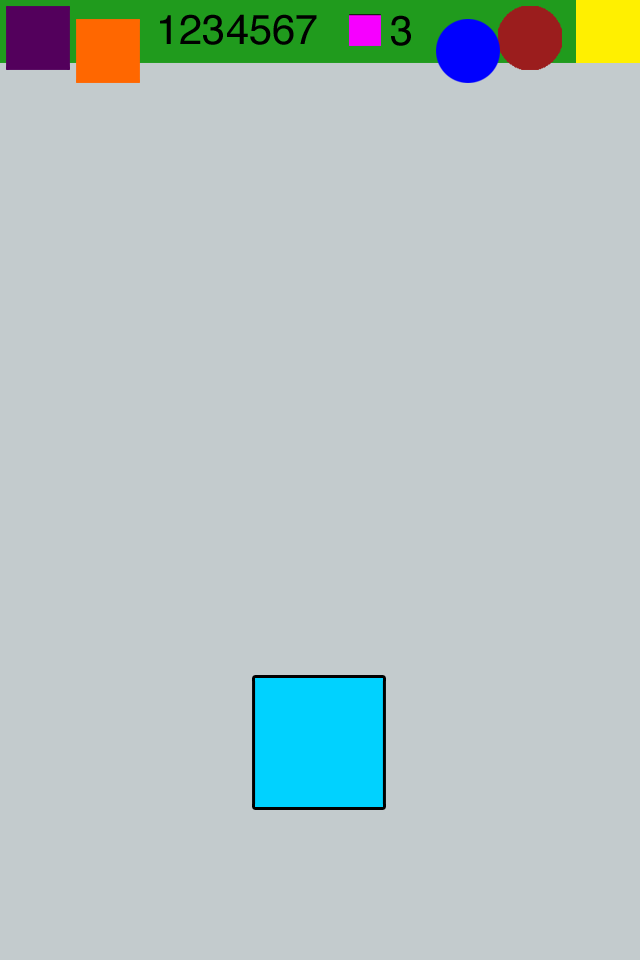
So before I get too bogged down in explaining every decision, here's the design:
I've decided to place all the "status" items at the very top of the screen, to avoid them being obscured by the player's hand when moving the Player Character.
While it is recommended to design interfaces to match other iOS apps. I have decided to deviate from this in one area. Based on the typical navigation elements, it might have made more sense to place the Menu button on the top left of the screen, as with Back buttons, etc. However, putting the menu button here seemed a little wrong when I saw it on screen, and based on the interfaces of other games, I felt it was reasonable to move it to the right. This button will present a modal dialog to the user and a Yes/No option that will either return to the game, or exit to the main menu screen.
The weapon icons and menu button are on opposite sides of the screen, as the weapon icons may be clickable, and the menu button should be isolated from any other buttons to avoid annoying mis-clicks.
Although not shown explicitly, I've also considered the form of the oxygen and shield meters. Initially I considered a gauge design, in keeping with the underwater theme of the game. However, this may be difficult to read at the small sizes of the meters, so an alternative would be to have a "draining sphere" effect, with the apparent liquid level in the meters falling as oxygen/shield strength dropped. I intend to prototype both of these styles to make a final decision.
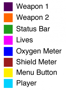
I used Sky Force as a guide in deciding sizes for various elements. Those listed above are sized as follows:
- Status bar - 640x64
- Oxygen meter - 64x64
- Shield meter - 64x64
- Lives icon - 32x32
- Weapons icons - 64x64
- Menu button - 64x64
- Player - 128x128
Enemies will be of varying size, but none should be smaller than 64x64. I've not settled on projectile sizes at this point, and will likely experiment to find a size that suits.


