Turns Out Brand Design IS Rocket Science!
Apparently, Pepsi have changed their logo - although the redesign hasn't filtered to their UK concern, seeing as pepsi.co.uk seems focused soley on Pepsi Max (suppose it goes to show that the British are more "extreme" than other nationalities...quite).
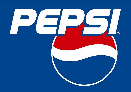
But how do you go from this:

to this:
The most sensible answer would be "bend the logo a little". But that's not the Pepsi way, no, they shelled out millions of dollars in fees to the Arnell Group, who combined pretense, pseudo-science, and an art A-level to produce an explanation for their cursory modification of a curve.
Their report, entitled "Breathtaking" (which I imagine is a reference to the hyperinflated invoice), proceeds through a study of the Pepsi brand over time, likening the new logo to the Golden Ratio, but with a twist (the twist being that it uses circles instead of squares). It then dives totally off the deep end, comparing the design to Earth's magnetic field, and implying that a 2D vector image can manipulate gravitational fields (or maybe that was some kind of psychology thing).
Just when you think they've reached the heights of pretention and bull, the Arnell bods manage to outdo themselves, designing the "Pepsi Universe", which seemed like the manner of hallucination you might experience after drinking 100 cans in a one hour sitting.
Download the pdf report [here].
